Project: DECENTER multimedia campaign
Types: UI, landing page, book, poster, infographic, branding
Client: Linnaeus University
Target Audience: educated Westerners with an interest in maps, world history, or science fiction
Role: I conceived the idea within given parameters and executed the design
Contributions: research, branding, typography, formats and layouts
Length of project: one month
Tools used: InDesign, Sketch app, worldmapgenerator
The task
Choose a message relevant to social justice and sustainability. Communicate this message through at least three media, digital or print. Consider how you tie these media together to express the idea: for example a campaign, visual identity, or exhibition. Include a total of 1000 words of relevant text.
Potential themes I considered:
• migrations—animal, human, language
• deconstructing the barbarism-civilization dichotomy
• scaled histories—geology, agriculture, written language, nuclear waste
• sociology of pain
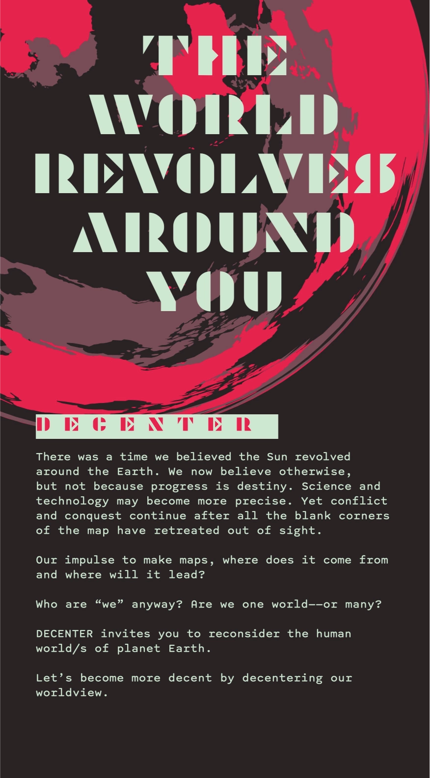
It can be hard to find a world map that doesn’t assume a Western outlook. I’d love to have one hanging at home, reconfiguring my image of the world. That wish led me to this potential campaign, which I’m calling DECENTER.
The campaign title is a pun. De-center (verb) means to remove the center or displace oneself from the center. Decent-er (adjective) means being more decent, generous, and fair.
My proposal
1. Message
History is fiction. Europe is not the main character. Through alternate visions of geography, I seek to promote decolonial world histories.
2. Audience
This campaign targets educated Westerners who appreciate history and geography but are only familiar with selective areas and periods of Europe and North America. This includes even myself. It adopts a posture of cerebral science fiction and will have special appeal to fans of the genre. The materials can be construed as an alien’s guide to the human world.
3. Research needed
Relevant areas: historiography, cartography, indigenous language and history, development of different writing systems.
Time was short, so I expected to keep my focus on maps and place-names. I’d rely on my prior research and experience as needed, though of course the ideal version of this project requires a diverse team of experts.
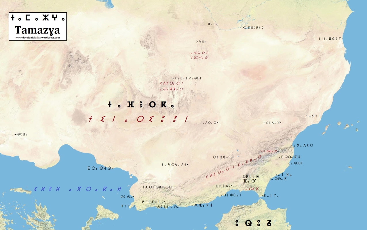
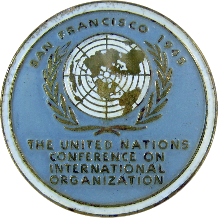
Comparable projects for inspiration and reference: Decolonial Atlas, Radical Cartography, Migrant Journal, and the Atlas of True Names. United Nations logo. Science fiction of similar tone and caliber: The Andromeda Strain by Michael Crichton (1969 first edition cover with planet framed in numbers, also 1971 film poster with baby framed in hexagon), 1984 by George Orwell (various editions have minimalist covers often dominated by text, geometry, and red color), and Axiom’s End by Lindsay Ellis (2020 first edition cover with ink-splatter planet on red background).
4. Deliverables
The general goal was a branding identity for the multimedia campaign.
Possible deliverables:
• typeface (e.g. constructed or endangered script)
• zine
• packaging label system (e.g. thumbnail map marking native origins of different ingredients)
• museum exhibit or installation
• mural
• book
• landing page
• data visualizations
At first I chose to make an infographic poster, landing page, and some kind of mural or outdoor installation. I wanted to work at different scales and in different media. The variety would show how the message might spread through various settings.
5. Projected timeline
I had three weeks and expected to commit about 40 hours total to the project.
Week one: develop and research concept, determine format and grid, consider colors and fonts
Week two: create landing page and mural
Week three: focus on infographic (may be more complex)
Result
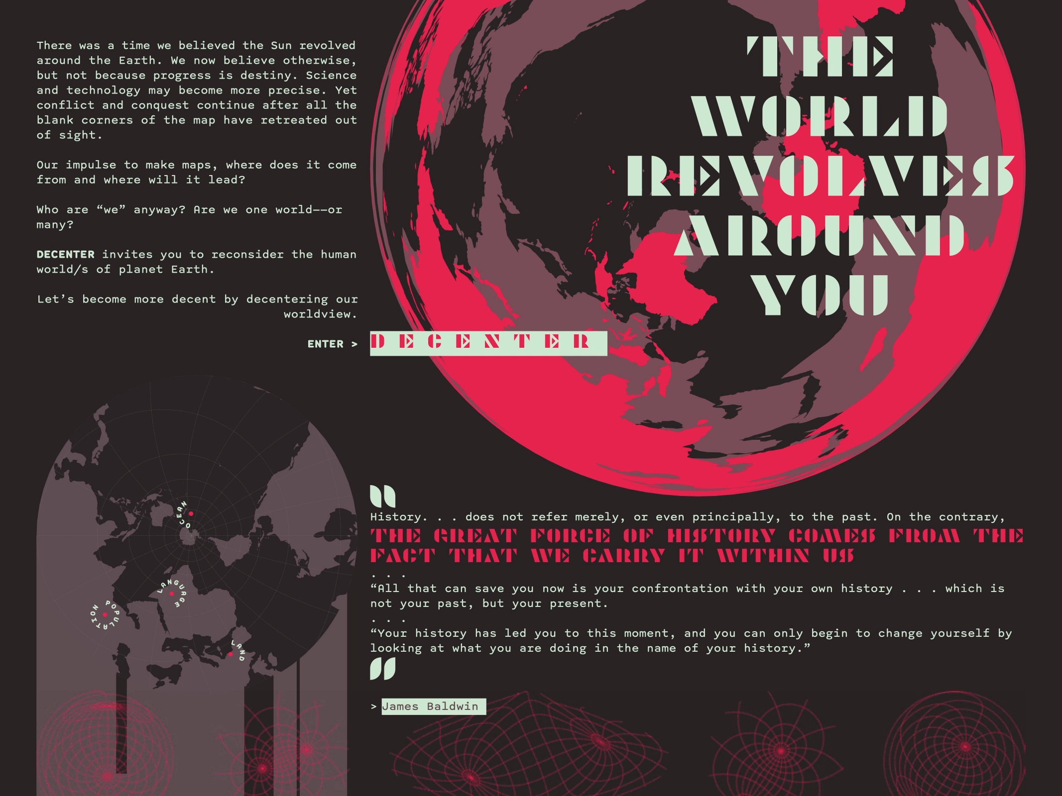
In search of the right voice and tone for this message, I turned to science fiction. This genre exists to explore the unfamiliar, consider the momentum of history, and rediscover modern society from alternate perspectives. It allows us to see humanity from non-human viewpoints. It makes our homeworld less familiar, which can disrupt our longstanding preconceptions.
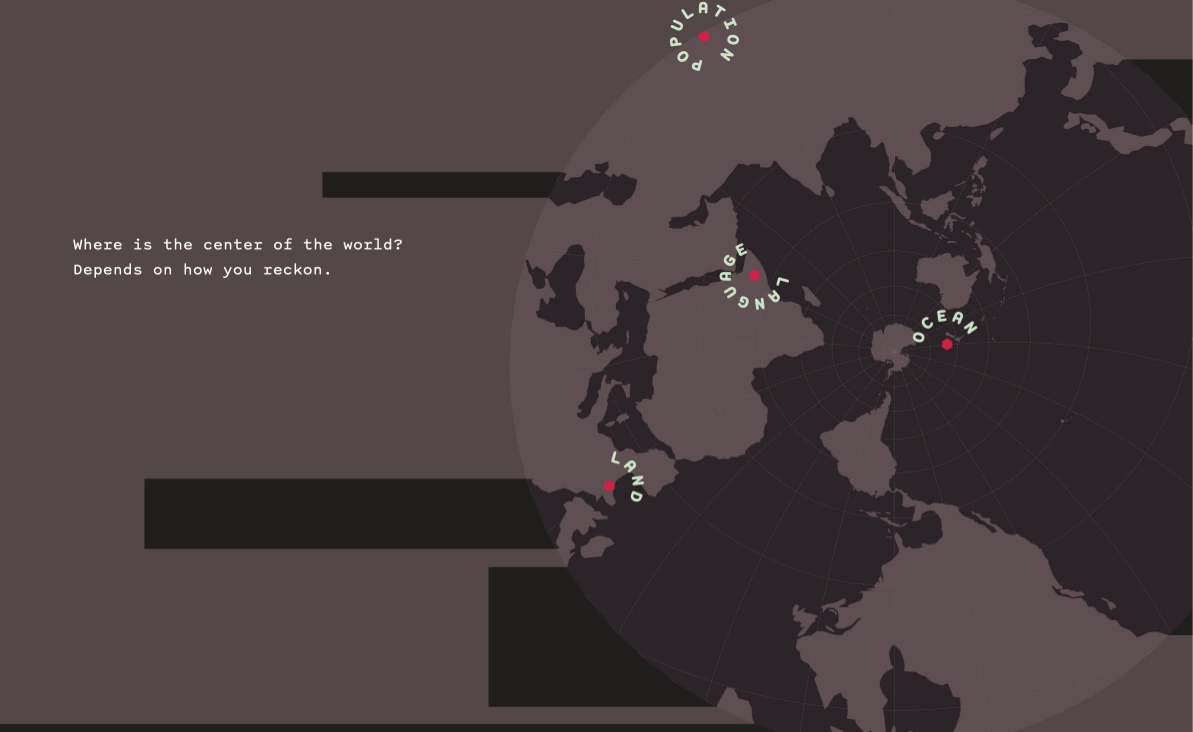
This landing page hooks with words and visuals, inviting the user to enter the site. High contrast seizes the eye. “The World Revolves Around You” provokes the viewer with a paradox. It abruptly contradicts reason, like the Orwellian slogan Ignorance is Strength. Yet it also admits our intractable tendency to center the world in our experience. Naturally “you” is not one person, but everyone who arrives at this page. So it’s true and false, but always meaningful.
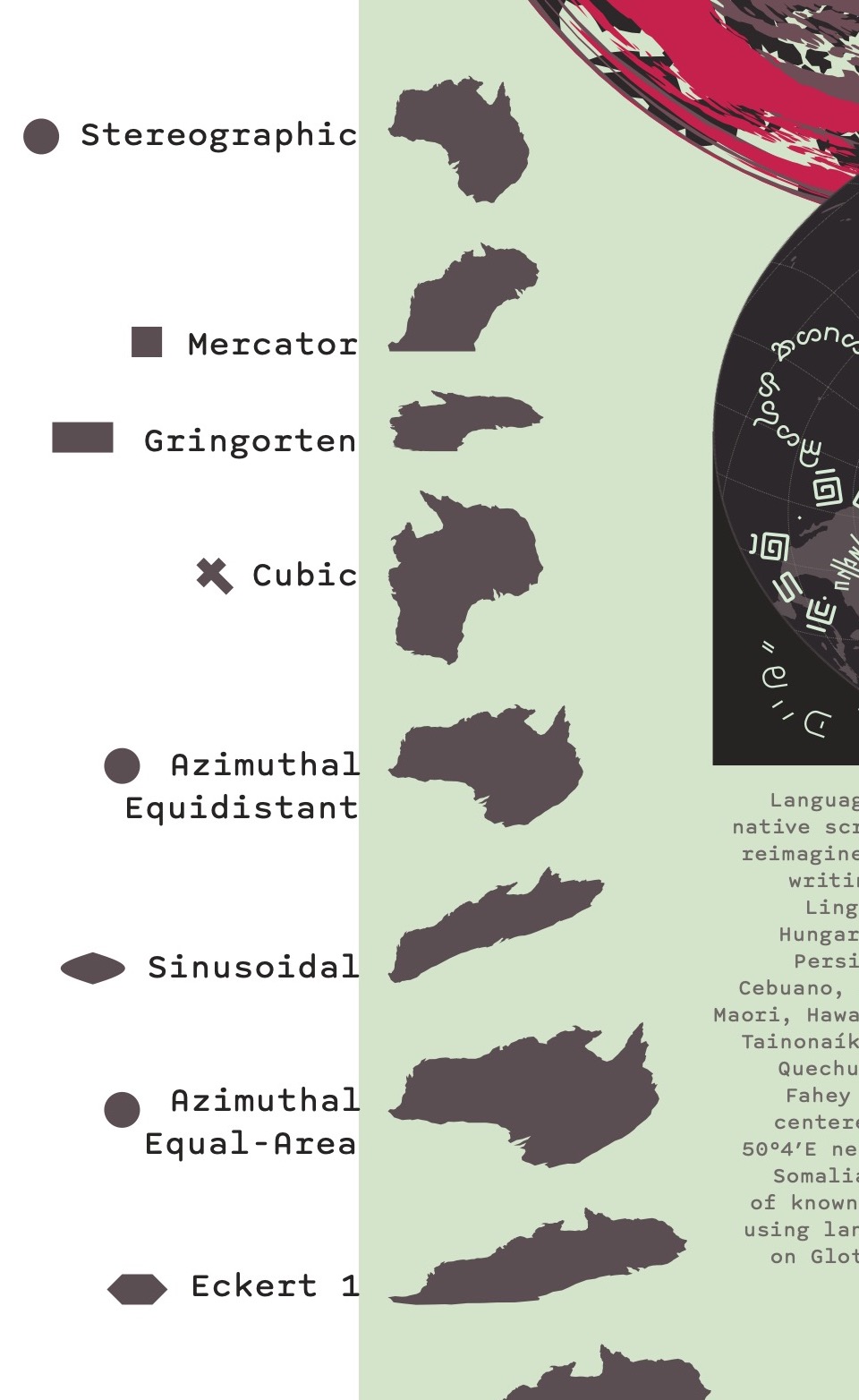
This poster is an infographic presenting the world through multiple perspectives. It depicts the different distortions in map projections using the continent of Australia, which is a known shape but rarely gets the same attention as bigger continents. The Australia at bottom has a strange shape because it is divided between the wings of the Waterman Butterfly projection.

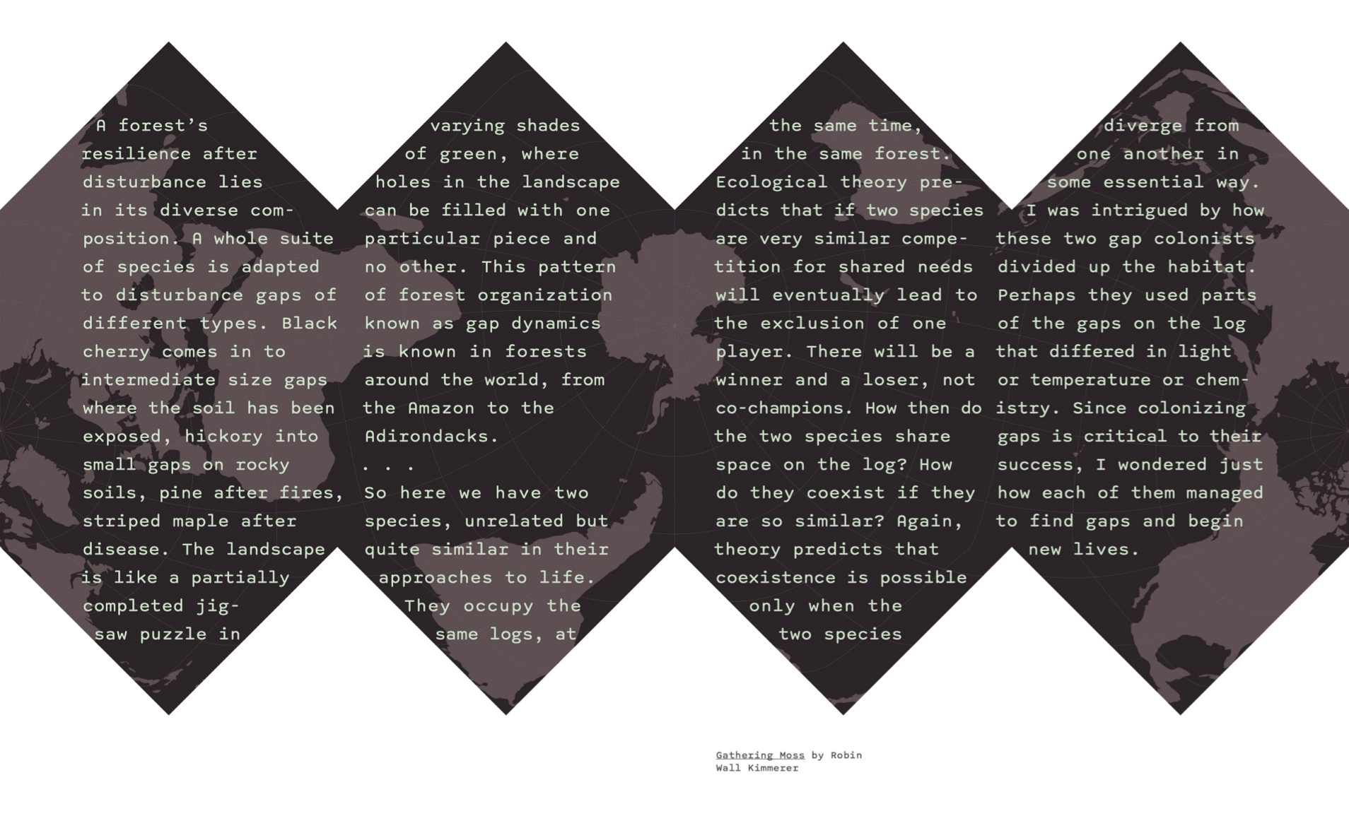
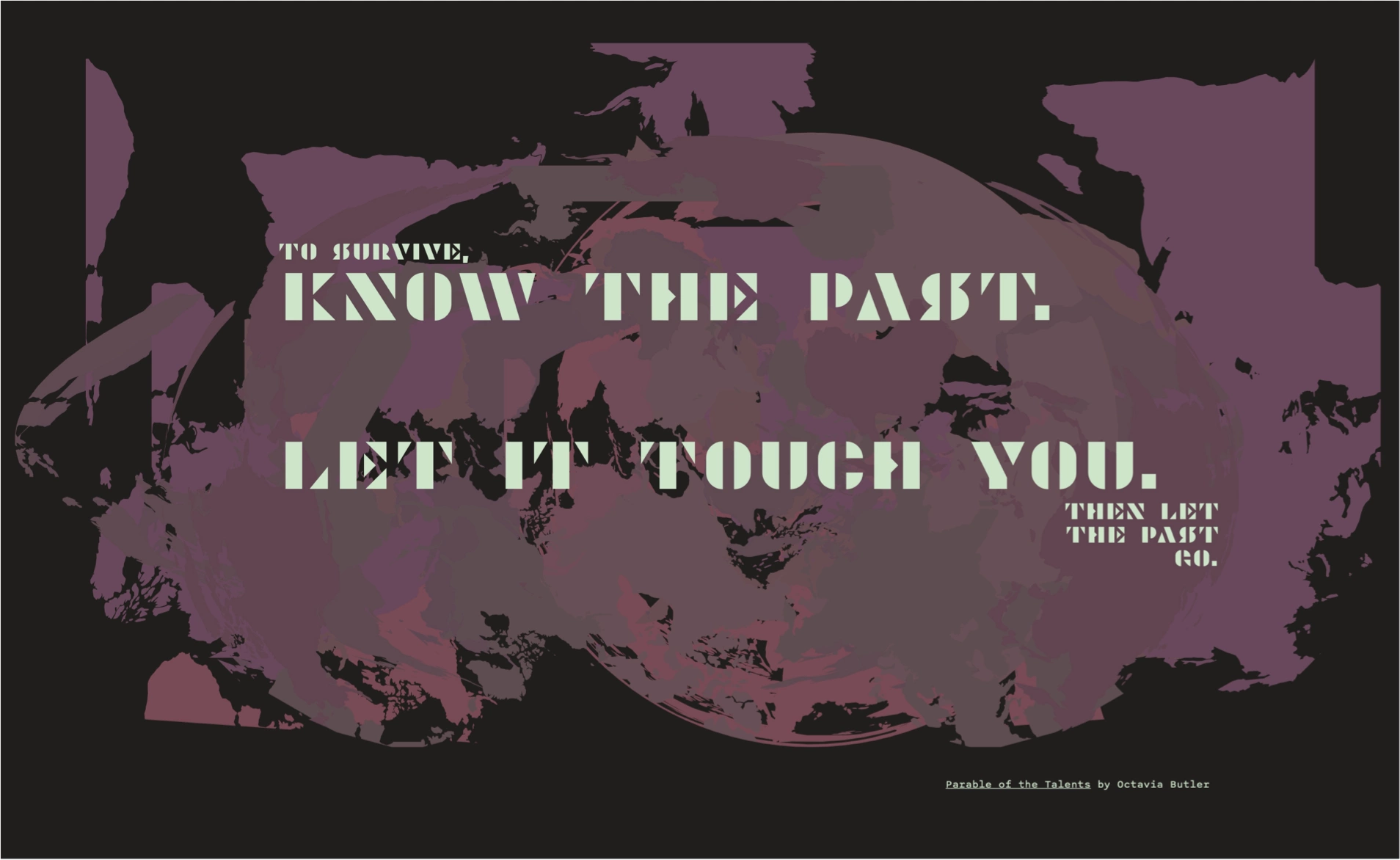
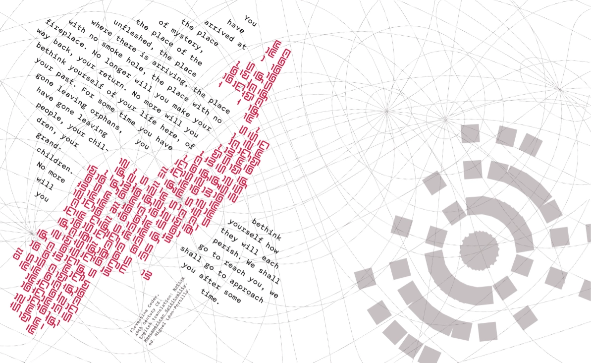
Instead of the planned mural, I opted for a book to show more information and detail. This book is a large-format art piece for the coffee table: part reference guide, part data visualization collection, part journey of discovery. Its cover illustration is derived from two sets of graticules (the imaginary latitude/longitude lines plotted on maps). I limited myself to several spreads which could illustrate the theme.
Notes from the process
The three deliverables are united by their common colors, fonts, and shape language inspired by maps (globes, circles, curving and radiating lines).
Modernia, the title font, extends the geometric style. It borders on illegible, which is true to a theme of defamiliarity. Likewise, almost no one can read the constructed scripts involved in this project, because most of these are new or experimental.
In contrast to Modernia, the text typeface is monospaced and modeled after a typewriter. This adds an impersonal, bureaucratic, scientific, and slightly anachronistic layer. It suggests uniformity and accuracy, but may also unsettle the viewer because of its unusual spacing.
Dark backgrounds create a more immersive atmosphere. Dark mode is popular now for its aesthetic freshness, besides being energy-efficient and gentler on the eyes. Yet dark fields with backlit text also evoke vacuum-tube screens of early computing and retro futurism.
The pale glowing green conjures classic sci-fi images of alien bodies and tech.
Red is vivid and humanistic, a widespread and ancient symbol of life and death. It has been another important accent in sci-fi imagery.
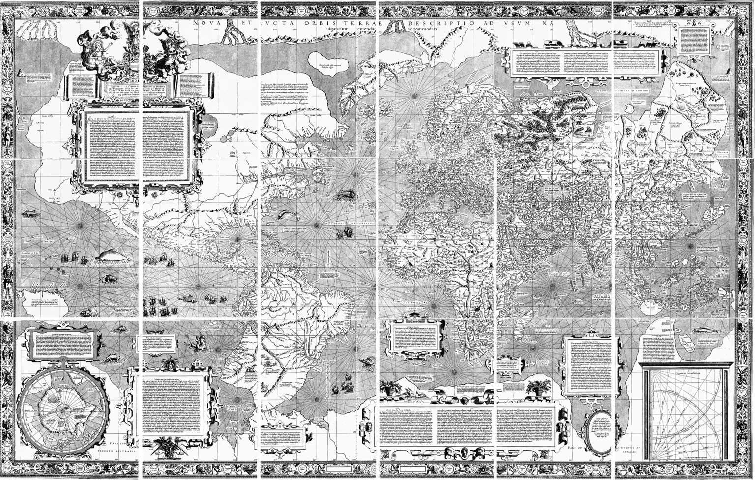
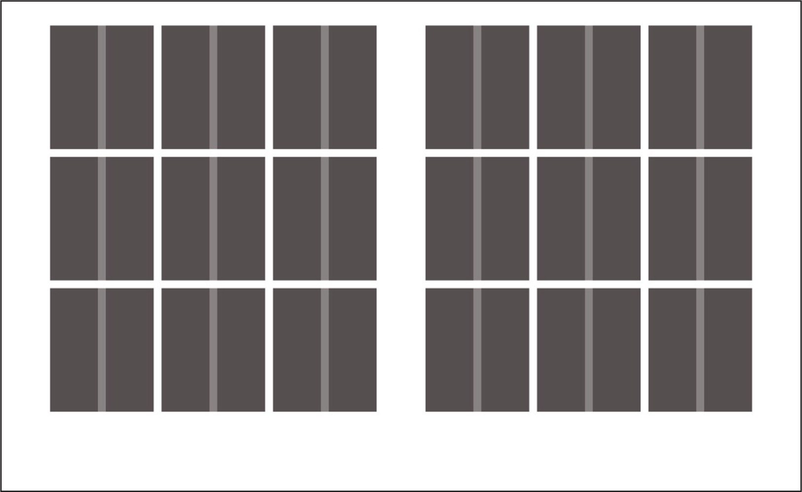
The grid and formats of my project are based on the original 1569 map by Gerardus Mercator, produced on 18 sheets arranged 6×3 for a total 202×124 cm. I applied the same ratio and 6×3 grid to my work, a subtle cue that I intend to overwrite the Mercator legacy of visual misinformation.
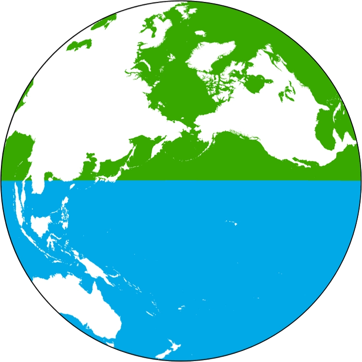
All projections of the planet’s surface distort it, so we have to make strategic compromises. Mercator’s projection is useful for navigation but infamously exaggerates the northern latitudes. It’s been renewed for the digital age as Web Mercator, used by Google and other major mapping applications. Over the half the world’s population is online since 2018. As a result, nowadays many of us picture “the world” like this:

The unusual projections throughout my project were created using worldmapgenerator.com.
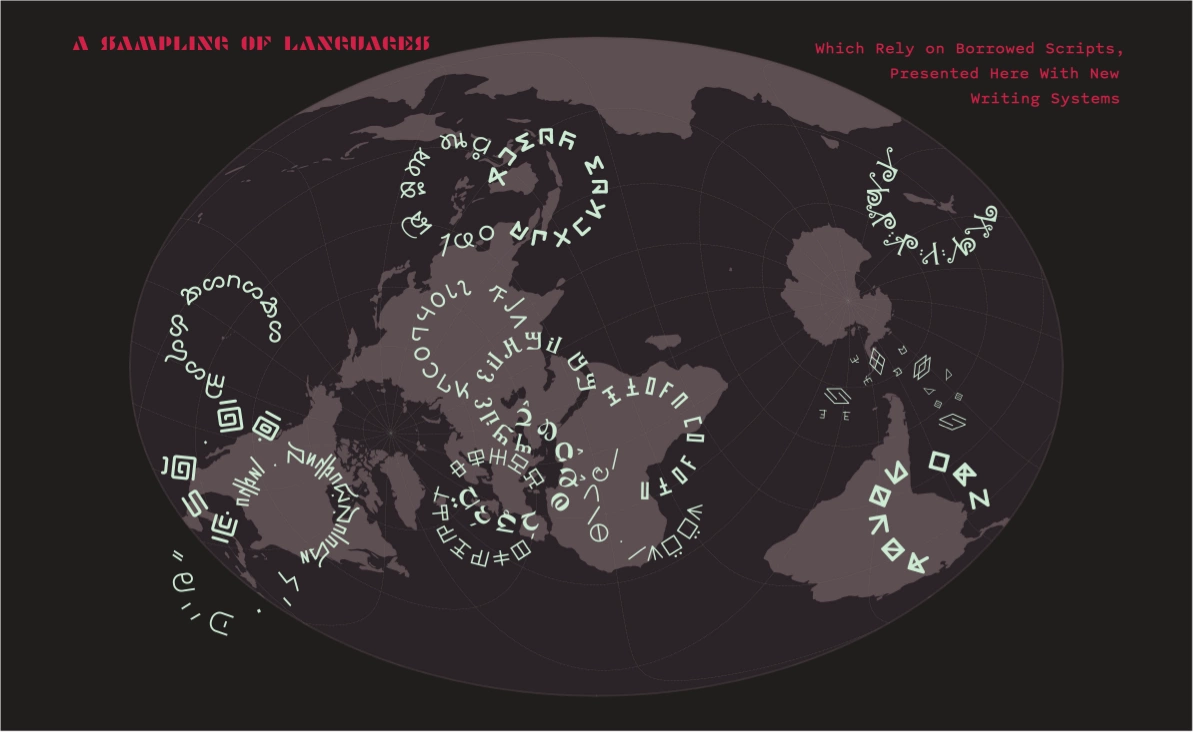
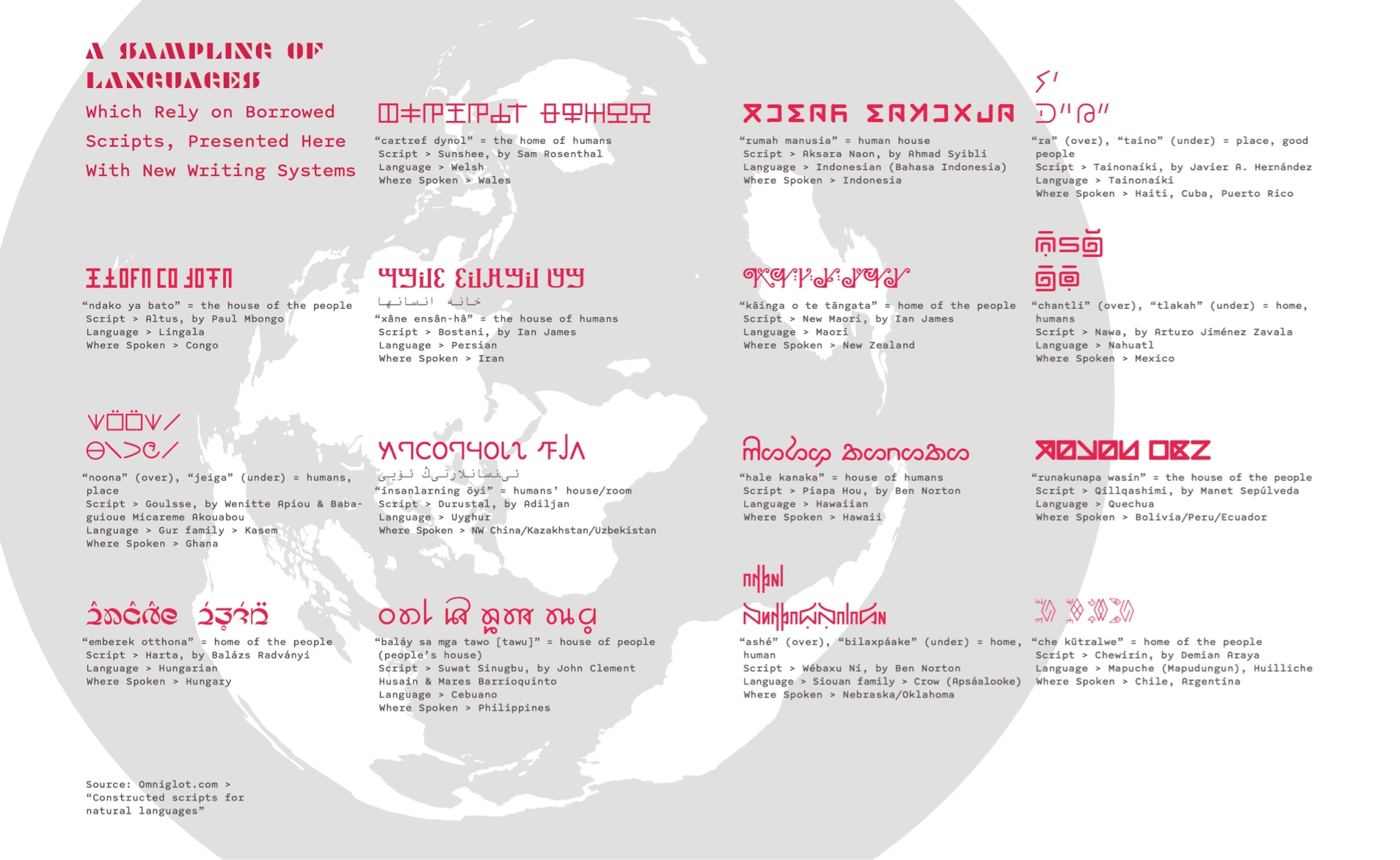
One way to decenter the English-speaking audience of this project is through marginalized languages: many of which belong to conquered peoples, some on the verge of extinction, and most lack a native script (often borrowing from Latin or Arabic instead). Likewise I chose many quotes about history and memory that challenge the narrative of universal progress. Several of the writers have a non-Western background.
Omniglot has an excellent collection of constructed scripts for human languages, including some with downloadable fonts. It was a vital source of my project, and credit for these con-scripts belongs to their creators (see the following spread from the book for attributions). I tried to choose native-speaking and indigenous creators whenever possible.
Looking back on the multimedia project, I realize it was overambitious. Trying to capture the whole breadth of the world in one three-week project is at best a questionable venture. My solution was to put emphasis on Central America while gesturing to a wider whole.
The project relied on research about maps and language. Although I invested a lot of effort in studying these areas, I’m not sure it communicates clearly. The result is visually cohesive. The conceptual cohesion simply needs more time. What I have is more of a prototype, awaiting robust content.