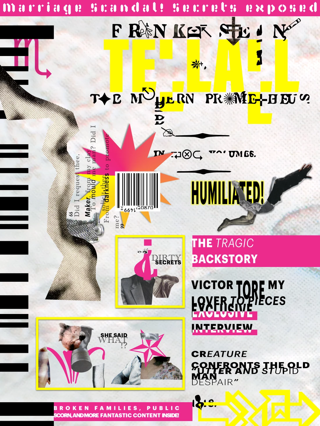
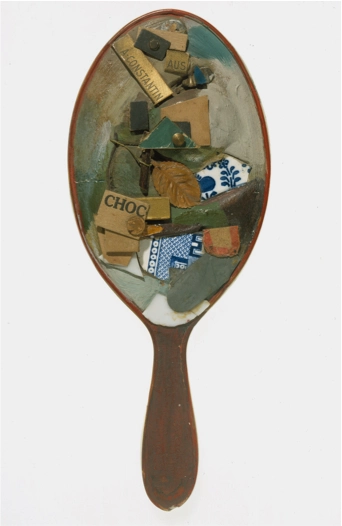
Final cover for the magazine’s Frankenstein issue.
Project: Frankenstein magazine article
Client: Linnaeus University
Target Audience: Connoisseurs of design history, celeb culture, and drop-dead gorgeous monsters
Role: Typographer and portrait dissector
Contributions: Transcribe interview, research esoterica, excruciate type and image, prepare page anatomies
Length of project: 6 weeks of filthy creation
Tools used: InDesign, Sketch, camera, materials rescued from the paper mortuary
To the READER, Cyberspace.
Malmö, Sweden, Aug. 2, 18—.
Dear Reader,
You will rejoice to hear that no disaster has accompanied my interview with the fiend. He is the creation of Mr. Victor Frankenstein, who died some years ago. I have seen the creature and will attest he is a beautiful and horrible sight to behold. I required some time to compose myself before composing his image. Here follows the account of my work.
[The task]
Frankenstein on Project Gutenberg, the foundation text
During my remote course of study at Linnaeus University, I was tasked with transforming a book passage from Project Gutenberg into an article for a contemporary magazine of my invention. What most enthused me was the opportunity to transform a literary subject for the modern eye.
I wished to reinterpret a scene from Frankenstein because this esteemed book by Mary Shelley led me to my university studies in literature. The popular picture of Hallowe’en infamy does not compare with the profound reality of the book. Her ghastly tale brims with questions to arouse the interest of any casual or career philosopher. Is monstrosity inhuman? Can mankind live beside intelligent beings of our own design?
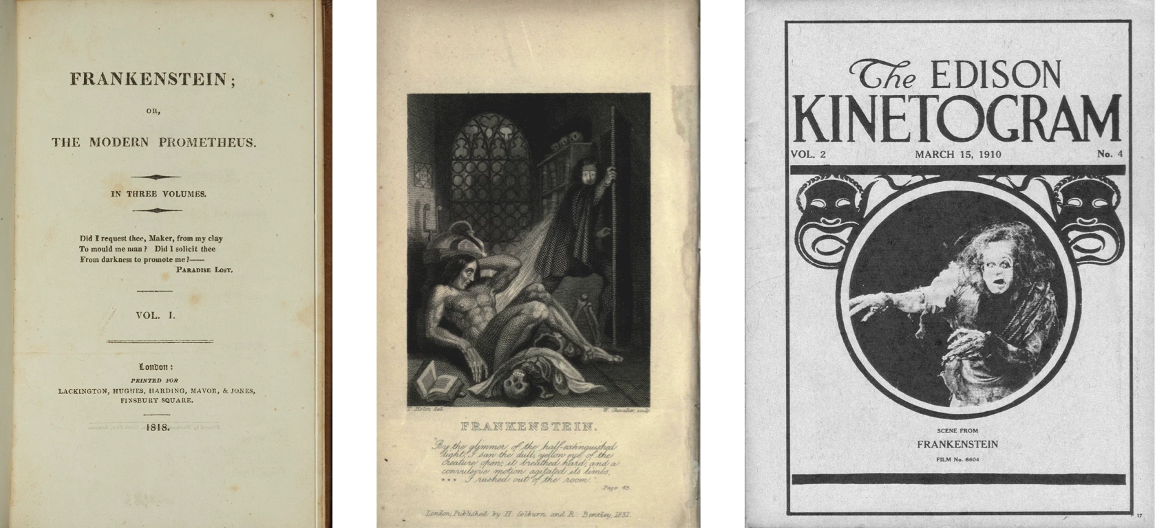
Left: Frankenstein first edition (1818) title page. Middle: second edition (1831) frontispiece. Right: first film adaptation (1910). I use elements of them all in my compositions.
I laid out a plan thusly: one week to search out inspiration, one week preparing design elements, two weeks assembling (in)coherent anatomies, finally two weeks of criticism and revision.
I made a faithful transcription of the interview precisely as it happened. The words spoken by Frankenstein’s creature are duplicated from the book. Others are my interpolation.
[Conception and philosophy]
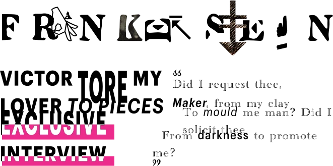
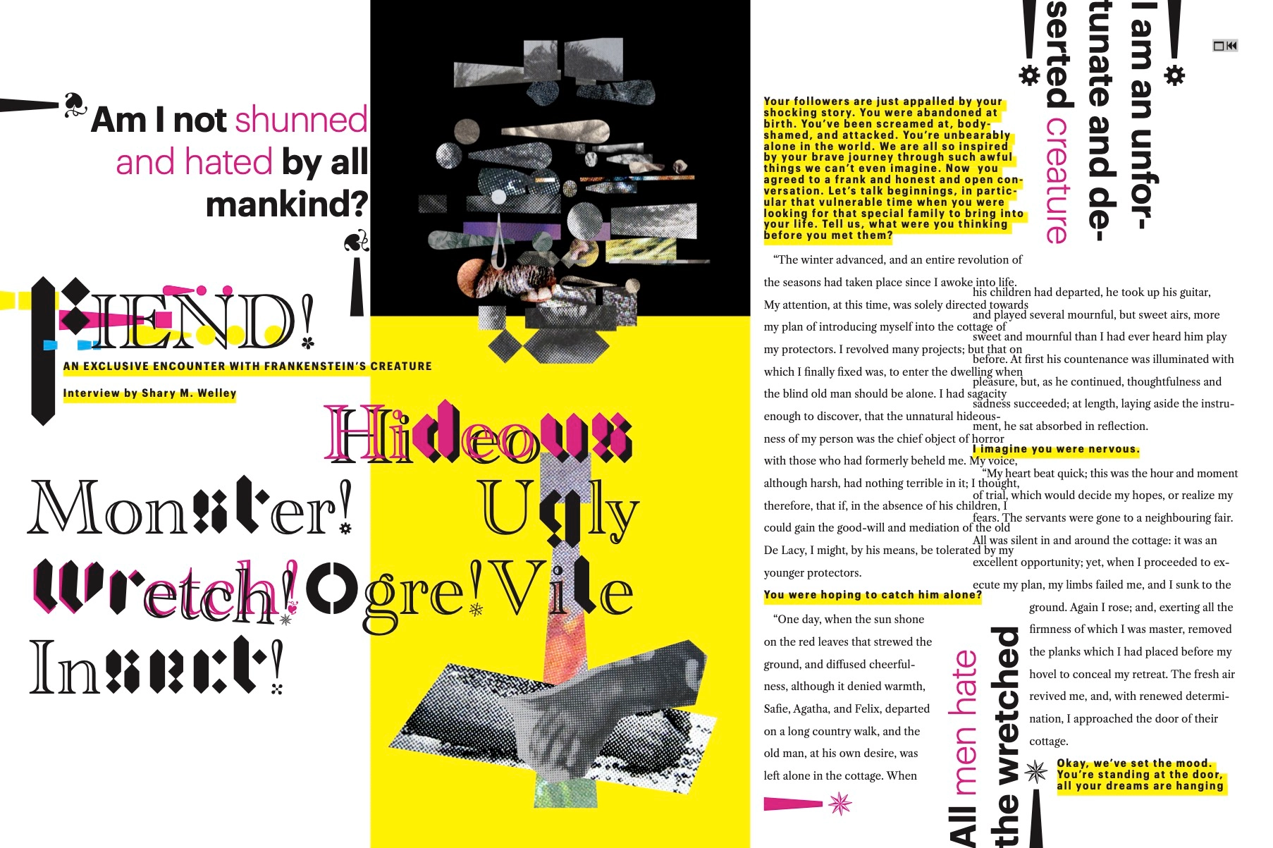
I hoped to evoke a gossip-ridden tabloid magazine, albeit more sophisticated. I would offer a fresh perspective on Frankenstein’s miserable fiend: make him a celebrity subjected to public adoration. Fame creates monsters. The public gawks and leers at them as if at zoo animals. I rather aimed to convey the authenticity—dare I say humanity—in a popular figure’s life, which is so often diluted in the outpouring of public shock, fascination, and disgust. The creature of Frankenstein is humane as well as cultured, despite the fear he inspires in all he meets. Even you, fair reader, may misjudge him.
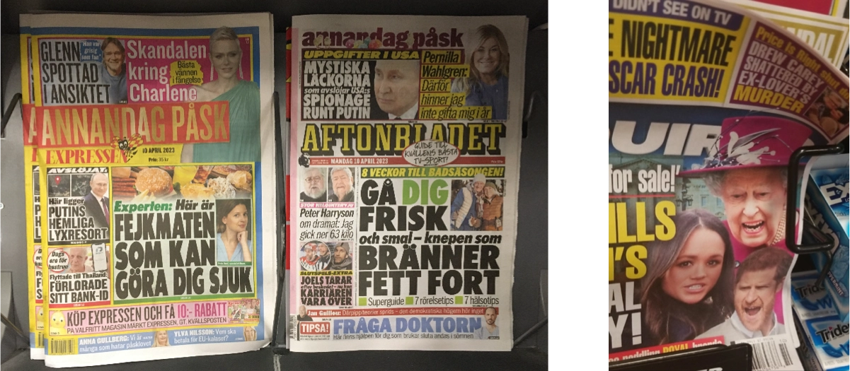
Tabloids at the news kiosk are bursting with colors, photographs packed together, and extrabold type: absolutely maximalist and really quite hideous. I set myself this challenge, to make the ugly beautiful.
Maximalist tabloids
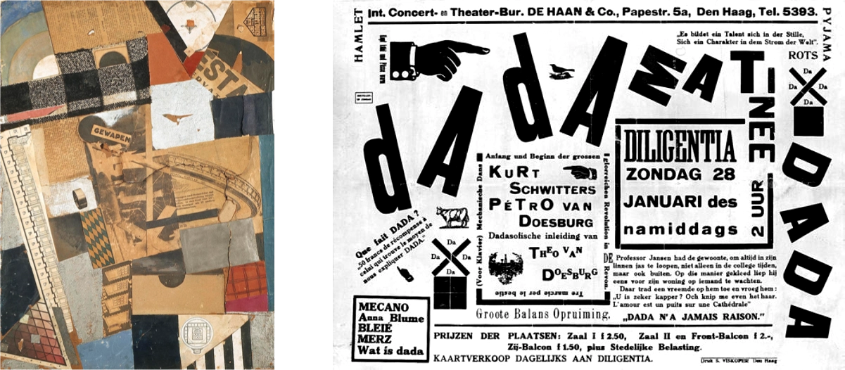
Dada works by Theo van Doesburg
[Development]
Mirror assemblage by Kurt Schwitters
I decided to follow the legacy of dadaism to give my design a clearer direction. The early 20th-century movement was uproarious and irreverent. Dada is an apt parallel for the fiend constructed from various cadavers. Likewise, a dadaist’s collage splices typography and chopped-up images from many sources. Dada is striking in its ugliness, like the monster. Dada exposes the failed potential of modernity, like the monster.
There have been, of course, more recent movements which carried on the tradition of dadaism, including the postmodern “anti-design” of the last millenium’s closing decades. I look to these later manifestations as well.
No dadaism in the Frankenstein Covers Project
Of the numerous editions of this book, I find none which employs a graphic style like unto dadaism.
I gathered photographic samples from the bodies of moldering publications consigned to a dim shelf at the back of the thrift store. I also culled a few specimens from my books and junk mail. All of these I revived in digital form beneath the lens of a makeshift scanning station beside my desk. My photographs enlarge the raster texture to high resolution, suggesting the microscopic views that might be observed by a student of anatomy in his secret toil. I decomposed these photos into fragments.
[Fruits of the labor]
The result is replete with haphazard maximalism—an heir to Dada, postmodernism, gossip periodicals, and the filthy creation of Frankenstein’s workshop.
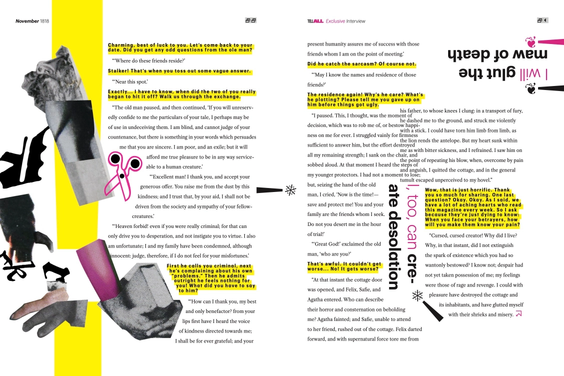
Across these compositions, layers of imagery jumble in a parody of structure. Text blocks bleed into each other. Occasional drop shadows mock the illusion of space. By recombining human figures at different scales, I build a monstrous impression. The range of type sizes reinforce the variance. Kerning and alignment suffer unholy displacements. Hapless letterforms are stretched on the rack. Within mere words, discrete typefaces join indiscreetly. Other words are defaced with puzzling symbols.

Yet in all this, I did not renounce all principles of order. Hierarchies are clear where they are needed. I arrange the cover’s violent circus around the off-center axis of the 1818 title page (pictured near the top of this page). For the purpose of imitation and limitation, I confined myself to pure C.M.Y.K. hues to complement a horde of typefaces and images.
The cover riots; but the interior dampens the furor. My unruly overlap between columns is controlled. In places it seems as if one element has trampled another, but I never allowed overlaps to break the flow of the text. Leading and margins are consistent. I distinguish the intrusive yellow-bold of the interviewer from the dignified oldstyle of the creature. A Caslon typeface, by the way, is chosen here for its popularity in Frankenstein’s epoch.
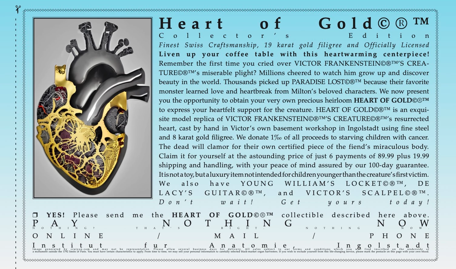
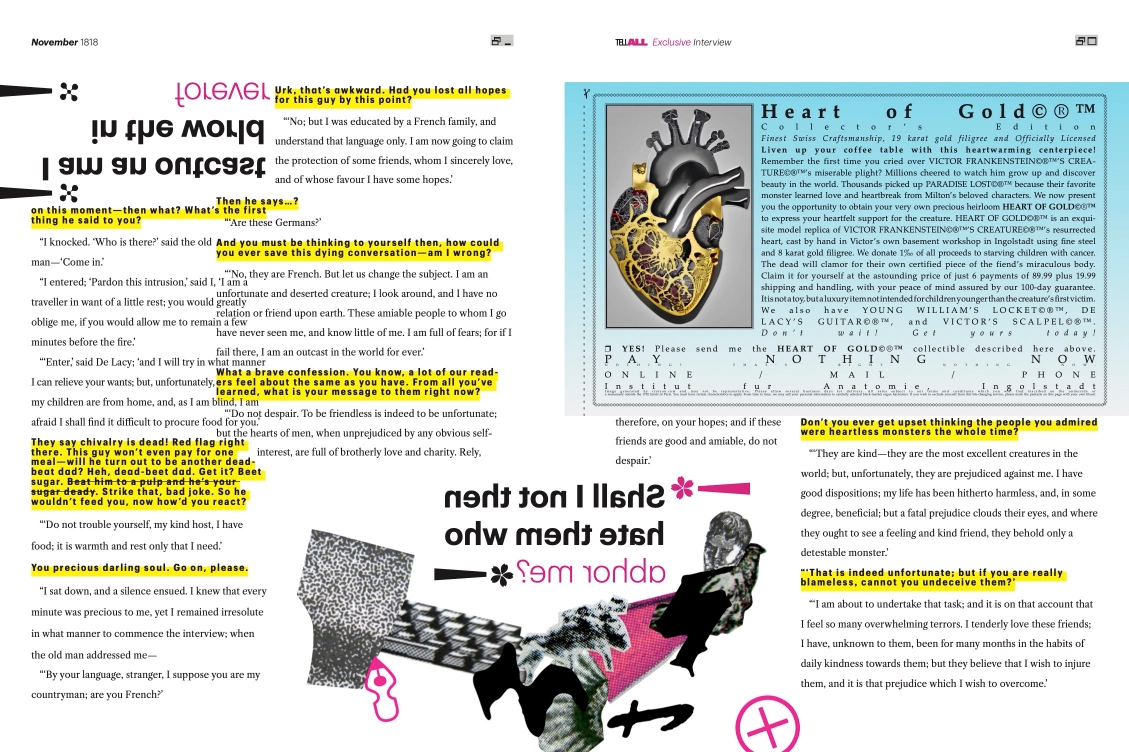
The “Heart of Gold” advertising insert is modeled after certain abominations I have seen in magazines of this ilk. With extreme justification and other sins, it should chill the blood of any typographer. I restrained the use of contrast therein and used cyan to set it off from the surrounding article.
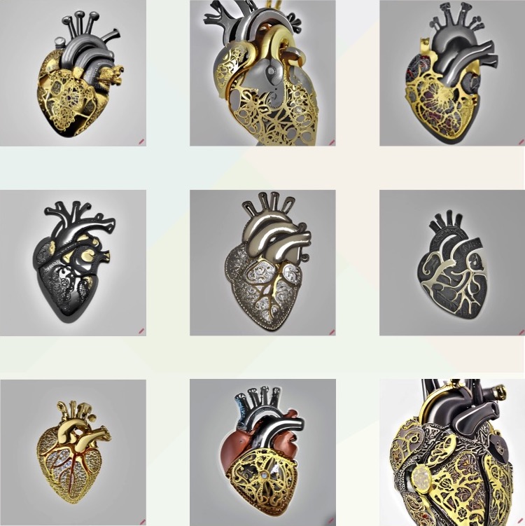
These images were generated on craiyon.com with queries like “precious heirloom steel anatomical heart with gold filigree.”
8 x 11 interior grid
What publication would forgo a dose of respectable folk magic? I derive some token numerology from the date, November 1792, in which the monster may have woken to life. My grid is arranged in 8 x 11 modules—a reference to the 11th month, November, and the corresponding 8th zodiac sign, Scorpio. Conveniently, the operations 1+7 and 9+2 (derived from the year’s sequence of digits) also yield 8 and 11. These two numbers add to 19, and a Fibonacci-style modular scale can be extrapolated therefrom.
Below: Final article, three interior spreads.
[Mistakes]
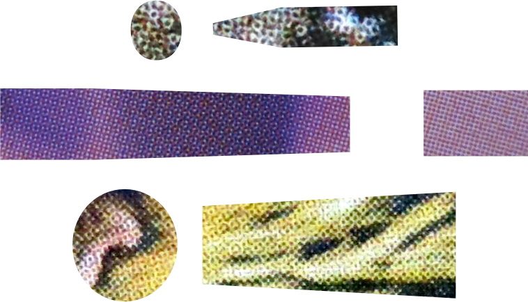
Goat, tulip, chicken.
I became quite engrossed in the labor of collecting collage materials. Often I concerned myself overmuch with the pictorial contents of an image. Later I discovered the obvious: a printed image turns obscure when first enlarged to reveal its raster texture, then cut down. No doubt you will find it impossible to identify the cloud, chickens, horse, goat, ape, flowers, skis, and sculptures from their photo fragments! Had I realized the futility sooner, I would have spent more energy searching for unique varieties of raster produced by different colors and printers.
Frankenstein Atlas, which alas I failed to use
Another leech of my time was an investigation of esoteric data from the book’s internal lore and historical origins. For example, I spent vain energies mapping Victor’s wanderings and searching out meaningful dates. Shelley’s text offers no easy outlines. I contracted literal headaches to pry these data from the bowels of the internetwork, and then further aches converting the birthdate into subtle visual cues. I thought I might use them to enforce some clever structure or system of randomness. In this I was disappointed.
Even the grid is no triumphant outcome. When placing elements, I frequently ignored it. Its clearest role is defining margins. It also allowed my columns to shift on every page and intersect at the width of one module. Some large illustrations rely on the grid’s flexibility to push body content off-kilter. Still I believe I have used grids more effectively in other projects.
I thank you warmly for your indulgence and hope to be in contact soon. Until that time, I remain
Yours truly,
D. Whitaker