Project: Fairy Tales on TV web redesign
Employer: University office of digital humanities
Client: Professor of English literature
Target audience: Academics who study media or fairy tales
Role: I was the UI designer on a team of four core members.
Contributions: Logo, color branding, typography, UI elements and styles
Length of involvement: 5 months
Tools used: Illustrator, InDesign, Sketch, Keynote
What is FTTV?
Fairy Tales on TV is a digital humanities project at a university English literature department. As described in the tagline, the project’s purpose is to collect, visualize, and analyze data about fairy tales adapted for television.
Jill Terry Rudy, project lead, has co-edited three books on fairy tales and folklore in media studies. One of these, “Channeling Wonder,” featured results of the project with related essays. FTTV has since generated published papers, a local symposium of the same title, and conference presentations at a US national level.
Problem
I was hired for an overhaul of the website’s visual identity, which was lacking coherence and appeal. Newcomers to the original site met with this confusing front page:

The images are taken from fairy-tale-inspired episodes of several TV shows. A few can be recognized, like the Simpsons performing Hansel and Gretel, but too many are esoteric. Which tales, which shows, and how they all relate to each other is not clear.
The background sphere is dated, low-res, disconnected from the floating images, and the chaotic tangle of lines (network graph) are already hard to interpret without the 3D distortion.
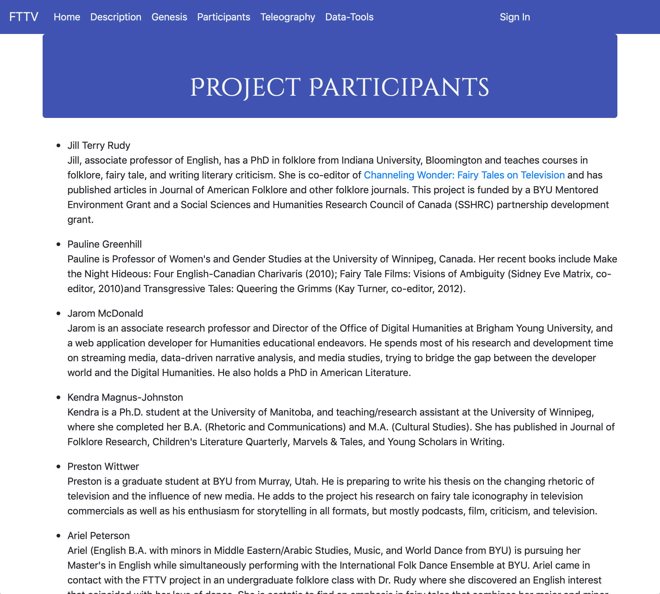
The content pages of the site did not much clarify its purpose. This information was given in blocks of text on the About pages, labeled “Genesis” and “Participants.”

Our target audience was professional academics and students with an interest in fairy tales in the media. It should also be approachable to nonspecialists, the public, ordinary people with similar interests.
The emphasis on data science, while relevant, would have deterred some scholars of literature. The outdated look did not encourage users to trust the digital platform. The unfamiliar visuals excluded many in the target audience.
Process
My task was to redesign the website so it would better convey the project concept. Fairy tales, data, and TV were the three pillars of this project. Each should be integrated, but in what ratio was a point of discussion.
I met several times with the project leaders and graduate students involved. First I presented moodboards with five different design directions: enchanted, literary, nostalgic, contemporary/rational, and Gothic. These boards each included a blend of historic material (e.g. medieval illuminated manuscripts) and related data viz or UI designs taken from sites like awwwards.
With the team’s input, I eliminated two of the five directions and remixed the others into more specific channels like so:
• Nostalgic (midcentury home television)
• Contemporary-enchanted (inspired by historic illustration media)
• Rational-contemporary (scientific, data-driven, cutting-edge, minimalist)
• Rational-nostalgic (à la International Typographic Style)
• Enchanted-nostalgic (inspired by pulp sci-fi and fantasy)
I prepared a second round of moodboards and quick paper sketches for possible UI concepts, layouts, and elements.
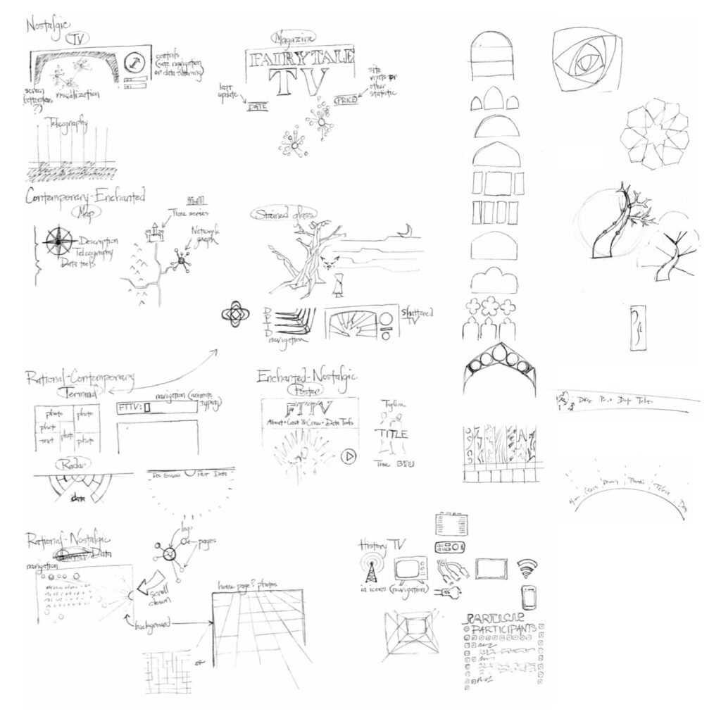
They preferred to emphasize the nostalgia, with a hint of the enchanted. We figured the data visualization aspect should be subtle to better appeal to the target audience. Instead, the aesthetic would combine a TV-style interface with the fairy-tale association of stained glass. Many familiar tales developed into their modern forms in pre-Renaissance Europe, where stained glass was an important visual storytelling medium—a bit like the TV of its time.
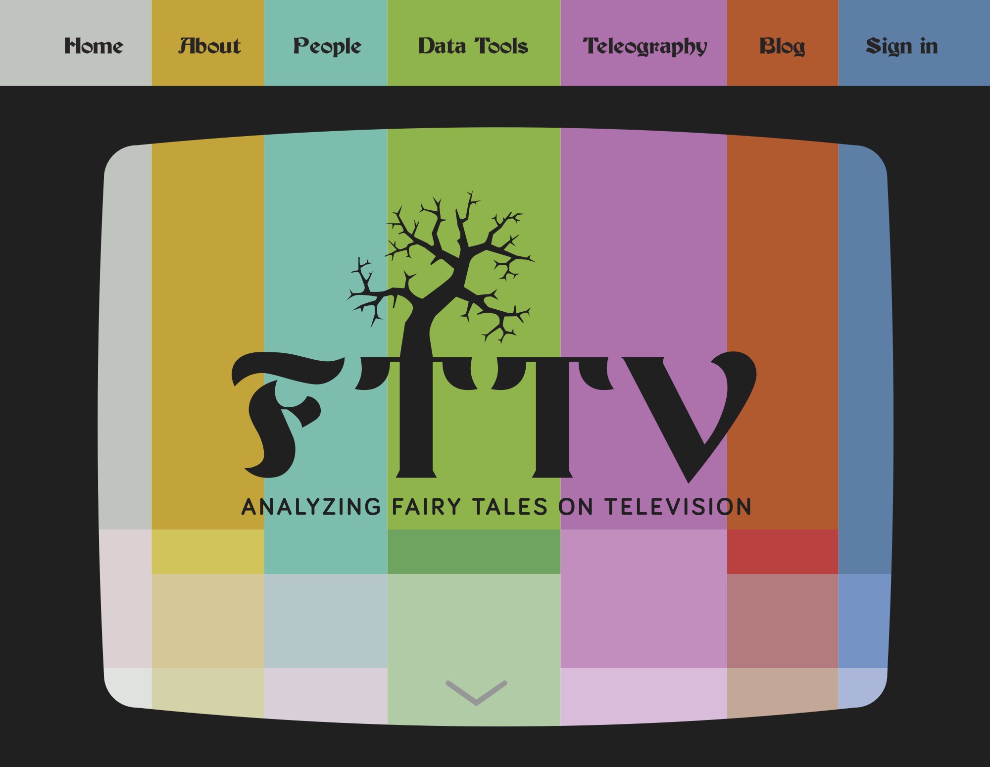
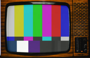
In my next iterations, I searched for a visual language to recall colorful story windows and 20th-century TV screens. I first imagined a shattered screen where the fragments would illustrate some fairy tale symbol or scene. Then I remembered the color bars test pattern, in use since color displays became widespread in the 1970s. It became the final cornerstone of my design concept. The bold colors and vertical bars convey TV even when they’re not framed by a screen. They also look like a sequence of vibrant window panes. After going half-blind from the pure hues, I diluted them into a more harmonious value range. This was important to make the nav bar coherent and accessible.
Solution
I created the aesthetic—home page and logo, fonts, color scheme, buttons, table styles, and other UI elements—to be implemented by a front-end developer. Later designers and developers tweaked the initial design to make it work within the constraints. The team unfortunately has limited resources, so the live UI in 2022 is still disorganized.
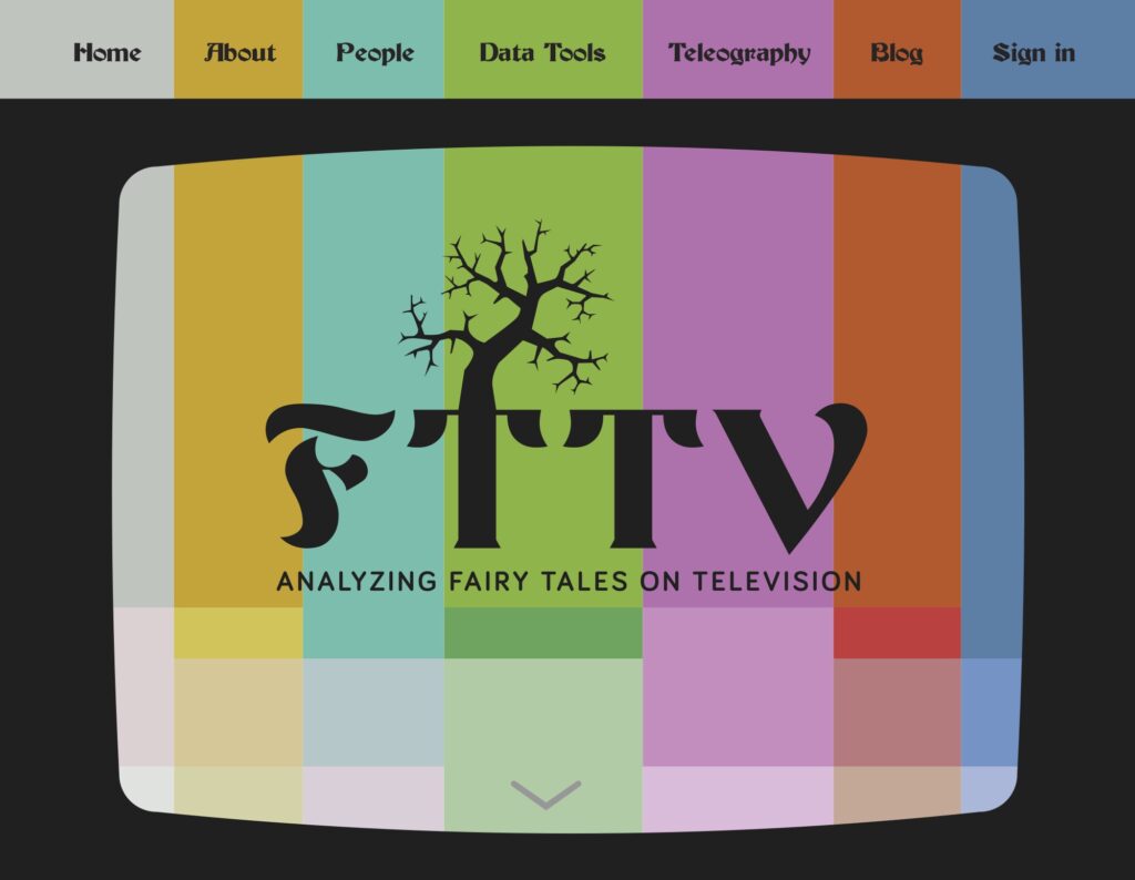
Many of the typefaces I considered were contemporary blackletters. Like stained glass, these also represent the Gothic period style for the stories under study. Our choice of Becker Regular has some playful energy to balance its antique status. Bariol Bold, used for subtitles and headings, is a geometric typeface, reinforcing the modern aspects of the project: television, data visualization, and web design. Bariol’s roundness also makes it friendly and a bit playful, echoing the fairy quality.
The tree in the logo has multiple symbolisms. It’s a shape like shattered glass, as per my earlier concept idea. It suggests the dark and thorny side of most tales, which often don’t end happily ever after. Forests are important settings for many tales. And finally, trees are data structures.
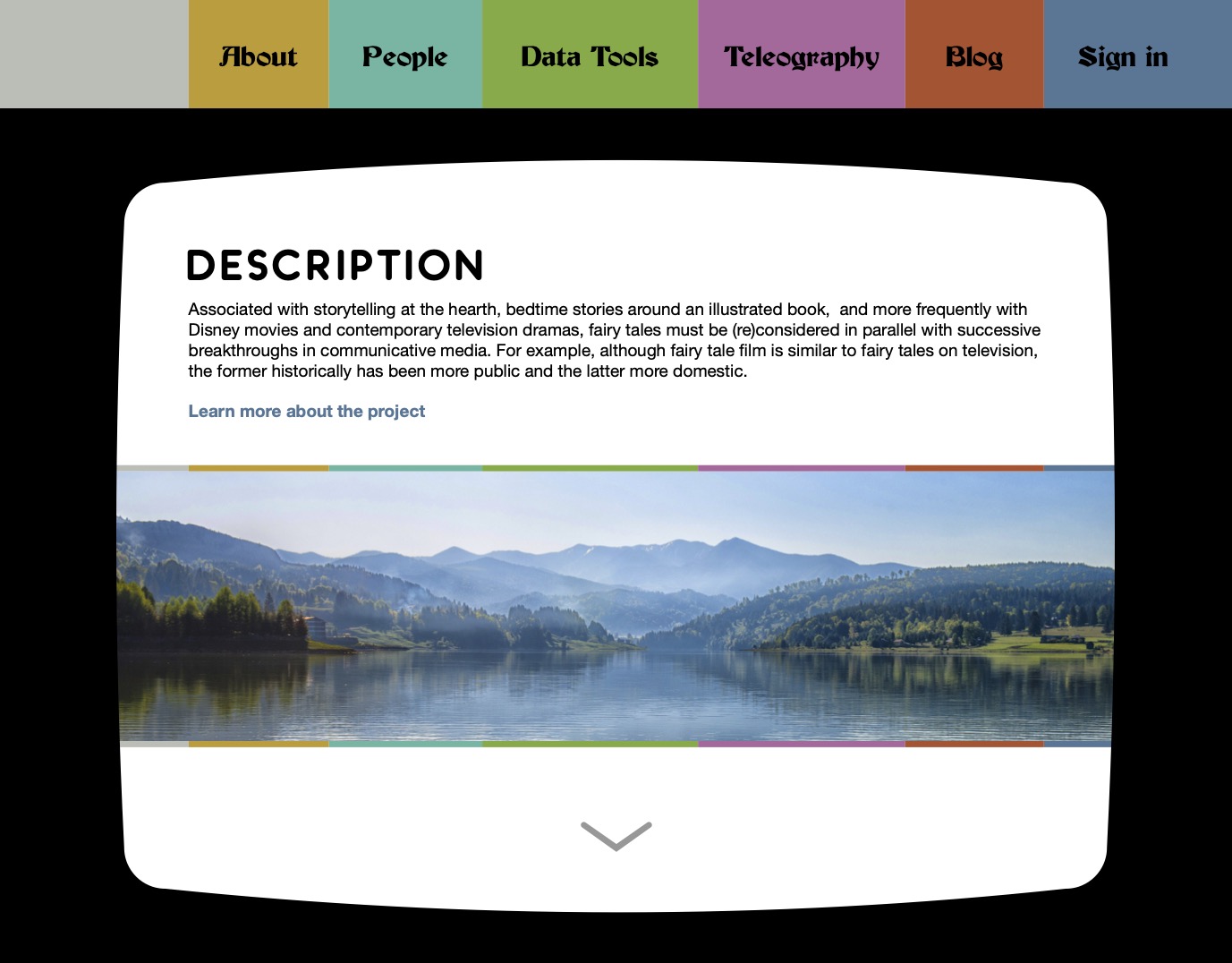
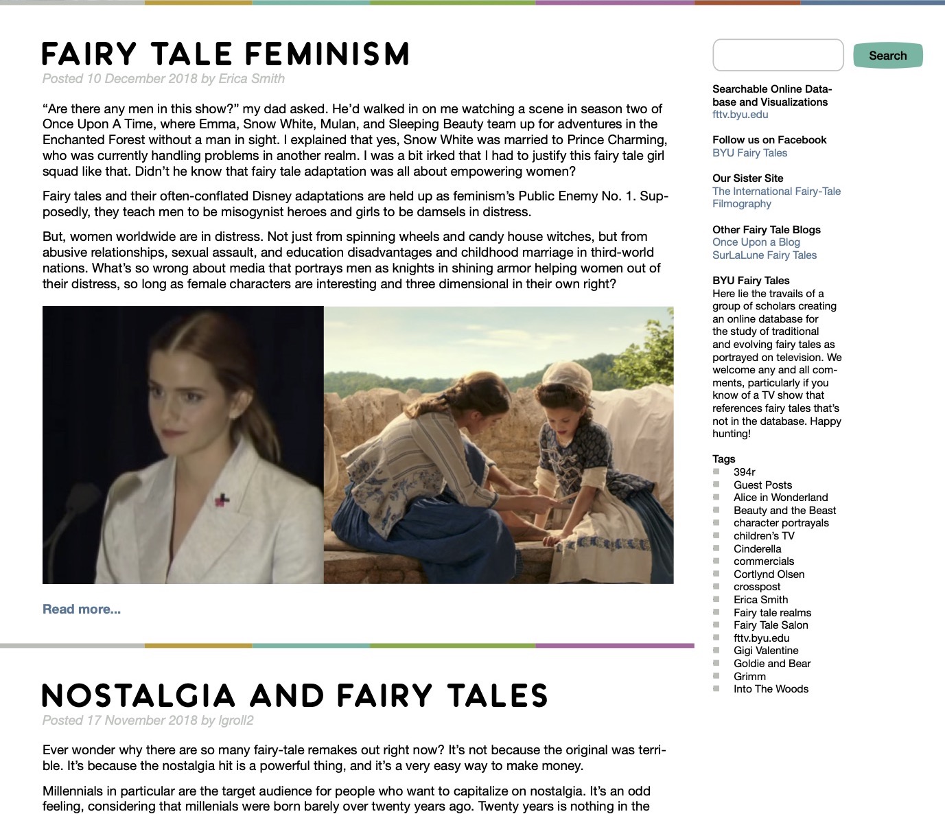
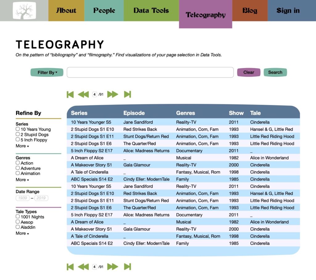
The color bars have distinct widths to match the menu items. They reappear as lines, dividers, text bullets, and link styles throughout the site. Gradients also extend the idea as interlocked panels of solid color, a pattern similar to treemaps.
Buttons and table shapes mimic the bulging rounded rectangle of a CRT screen or buttons on a TV remote.
Missteps?
I’m not sure whether it was wise to give so much attention to color schemes, and so early. It was sometimes overwhelming for the client. I suppose it led me to make color the central theme of the site, not by any means a bad choice, but I wonder if it kept me from other good solutions.
One limitation on font choice was budget, another one my junior expertise. Since then, I have learned far more about fonts and how to use them. I would likely choose a more refined display typeface and increase the tracking so the capitals have room to breathe. As I’ve recently been studying type design, I might even create custom lettering for the logotype.
My biggest mistake might be neglecting user research. I was not very familiar with UX best practices at this time, and was hired for more of a strictly visual/UI role, but the role of user advocacy fell mostly on me. Two of us did several some informal and sporadic surveys, but nothing organized. Fortunately my contribution was cosmetic, with almost no effect on the site’s structure and functionality.
