Project: Bloom & Bounty logo
Tags: Branding, Web, Print
Client: Ellen, founder of small Utah business Bloom & Bounty
Target audience: Active adults looking for a robust, healthy snack
Role: freelance designer, branding consultant
Other contributors: Zach (digital marketing consultant)
Length of involvement: 1 month
Tools used: pen and paper, Glyphs app, Sketch app, Procreate
Discussion
I met weekly via Zoom with Zach, a digital marketer, and Ellen, founder of Bloom & Bounty food products. In these meetings I guided the brand exploration process and presented my work to get their inputs for the logo development. She had already perfected the first product, a unique granola. The plan was to bring this granola to upcoming local festivals and farmers’ markets. Our deadline for debut was the first market, a month away.
As we began exploring the brand and its visual style, Ellen hadn’t yet decided on the company or the product names. At this phase, I got involved in pitching possible names. She settled on Lush ’Nola for the product name, which came through a chain of ideas. Ellen’s sister remembered a clever contraction, LN = Ell-en. Our digital marketer proposed several expansions for the acronym, like Love Nola. Later I added Lush Nola to the list, which in time became Ellen’s choice of name for the debut product.
Through our meetings, we outlined the following conclusions to inform the design:
What are the core values?
• Honest, trustworthy food.
• Satisfy cravings and stay full longer.
• Empower healthy lifestyle.
We later distilled the key brand attributes to simple, truthful, and independent. Close contenders were soulful and grounded.
Who will love this?
• Gluten-intolerant teenager, take to school and athletic events.
• Local ice cream shop owner would like to add granola as a topping.
• Single adult wanting easy dinners.
• Busy parent in active family, eat for breakfast or take camping.
What brands appeal to the same audience with the most similar product/s?
• Purely Elizabeth, Bear Naked, Bola Granola, Magic Spoon
How will it feel to engage with this product?
• Reconnect with nature.
• Bring people together.
• Versatile options, everyone has it their way.
• Cut through confusion, simplify good living.
• Crave the texture.
Ideation
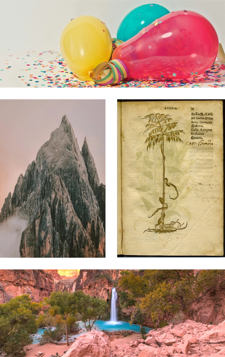
I prepared moodboards for five possible directions: party, adventure, oasis, wisdom, friend. The related images at right are from pexels.com.
The soft and chewy texture is possibly the most distinguishing feature of Lush Nola. Hence the name: lush, full, succulent. Contrast the standard for granola: dry, hard, crunchy. Ellen emphasized this contrast in every conversation.
In working out the product name, we arrived together at the image of a fresh paradise in the desert landscape of dry granolas. This image turned into a driving force for the brand and the logo concept.
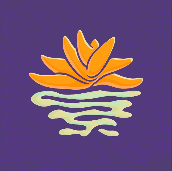
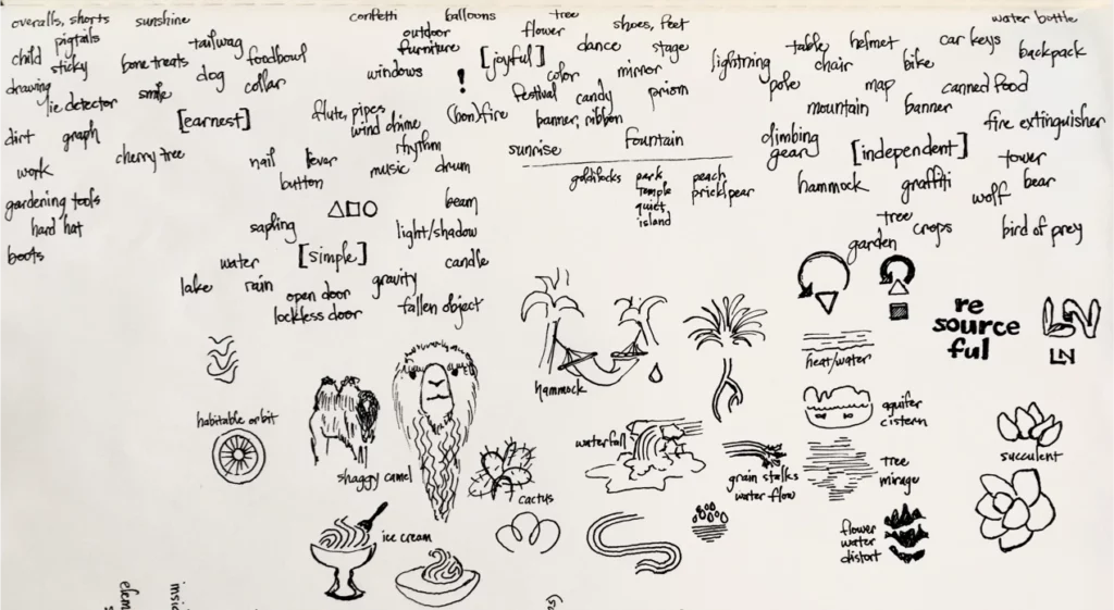
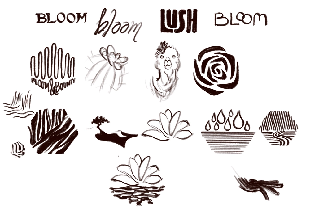
I mapped out word concepts and sketched various ideas, with special focus on water, the blooming oasis, and related elements from desert landscapes. Ellen found the camel compelling, and the flower even more so. Through a second round of more refined sketching, I developed the symbol of the flower. In the symbol’s lower half, a sinuous interplay of light and dark could alternately represent water, soil, or dunes of sand. All of these support the intended theme and message.
Revision
With some feedback, I could see the water of the lower half was feeling deep and viscous, like oil slick or a bog. The mood was wrong. Moreover, the outlines were overly complex for a logo. I streamlined the curves for the final version, which gives a brighter and clearer impression.

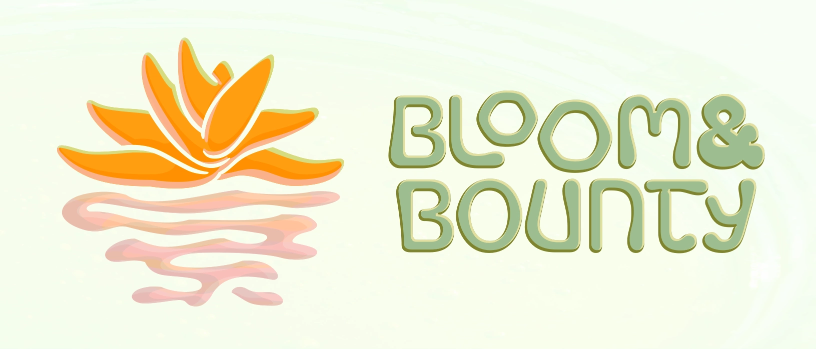
The final company logotype is a reinterpretation of Bagel Fat One, designed by Kyungwon Kim and JAMO, available under the Open Font License. For the company’s first product, Lush Nola, I chose Rakkas Regular by Zeynep Akay, also available under the OFL.

I kept the shape language soft and rounded to suggest fruits, honey, fullness, and ripeness. The logomark fills a hexagonal space, and I hinted hexagons in every ‘O’ to evoke honeycomb. The oblong terminals on the strokes suggest organic features like bulbs on plants and dripping honey. Together with the water/flower logomark, these details impress the succulent quality of the granola.
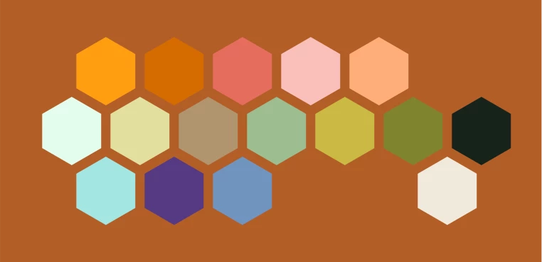
Colors are picked from imagery of succulents and their blossoms, desolate earth and sky, and natural pools.