Project: logo for Maya outreach group
Client: hypothetical indigenous organization in Central America
Target audience: rising generation in modern Maya communities
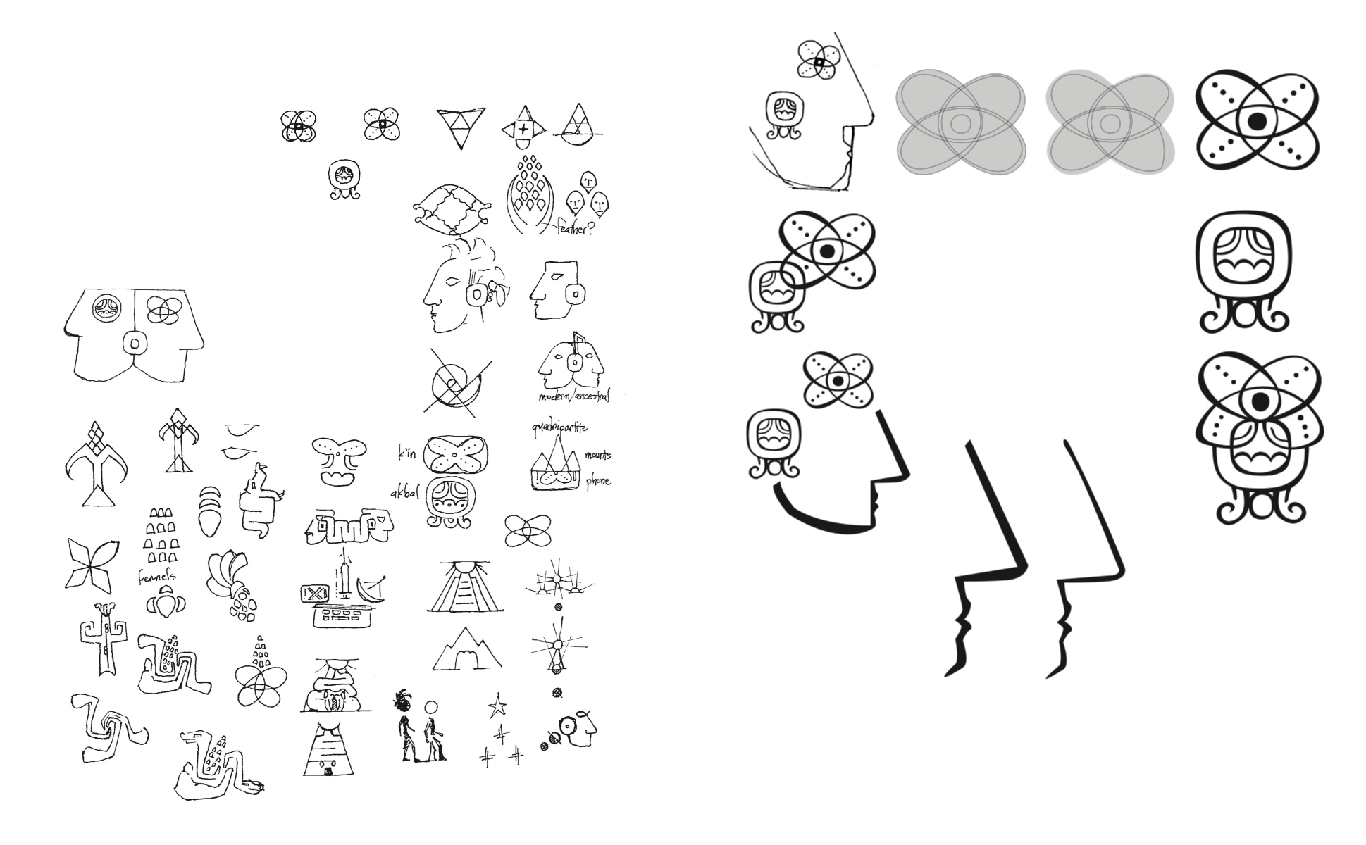
Contributions: originate concept, research, adapt ancient symbols for modern brand
Length of project: 2 weeks
Tools used: pen and paper, Illustrator, LiveSurface Context
Instruction: Create a symbolic, image-driven, conceptually complex logo (mark, symbol, trademark, brand mark, etc).
My work demonstrates a branding project I would be excited to join. I was assigned this task as a student soon after a semester studying the arts and cultures of the ancient Maya.
The client is a hypothetical organization which might work with young people of Maya descent, teaching and arranging events to reconnect them with their roots. The organization would be involved in defending rights of the Maya and their cultural history from exploitation and erasure. I decided the focal principles of this identity are rebirth, continuity, and centering—each one is fundamental to the Maya worldview.
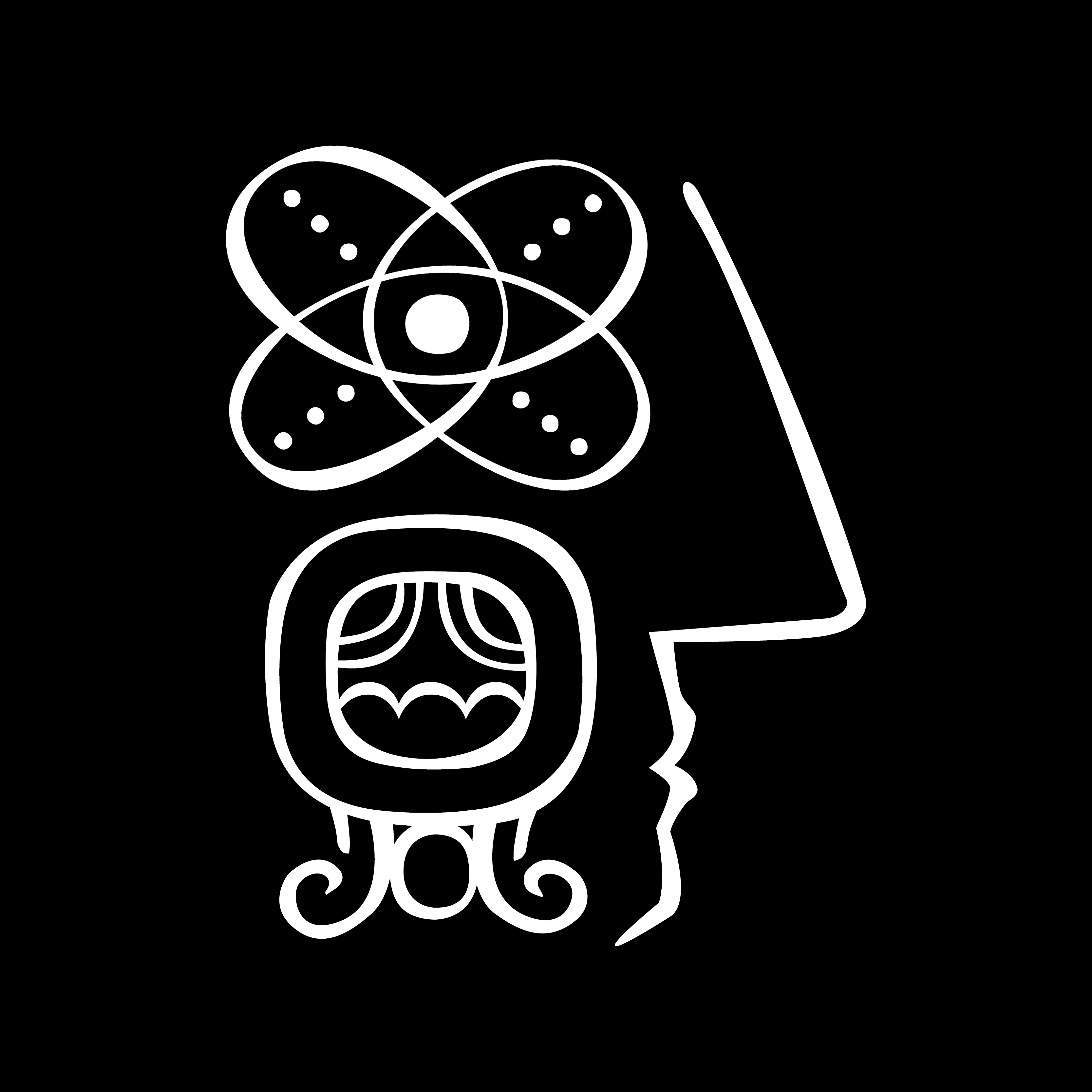
The logo is formed from two glyphs of the Classic Mayan written language (current from c. 250 to 925 CE). Central America is one of the world’s few birthplaces of writing. Texts carved in stone and painted on ceramics have been preserved for modern study and revival. The Maya people, whose ancestors built great cities and tracked the stars, number in the millions today. Their traditions have continued through conquest and centuries of hybridization with Spanish culture. Yet like the fate of many indigenous peoples, Maya heritage is threatened.
Though not obvious to most viewers, this identity is a logomark and a logotype. K’in means day or sun, while ak’ba’l or ak’ab’ means night. Together they express the eternal cycle of death and rebirth that people experience each day at sunset and sunrise. This cycle is central to Maya theology. The world regenerates through the partnership of gods and humans, living and dead.

Quite a few Classic Mayan glyphs depict faces: divine, human, animal. Here, by combining the two glyphs in unconventional form, I evoke a human face in the gestalt. K’in is the eye, while ak’ba’l represents an ear flare, a piece of jewelry often seen in Classic Maya portraits. The arrangement is abstract, not anatomical. It reflects the grid format of a Mayan text and the tight interlocking quality of their artwork. I express ancient symbols with a modern style, hopefully without disrespecting the tradition. So the text is human: a person who can symbolize the ones who came before and the ones who now remember them.
Groups with a similar mission in recent times include the Pan-Maya Movement, COPMAGUA (SAJB’ICHIL in Mayan, an acronym for Coordination of Organizations of the Maya People of Guatemala), and the International Mayan League. I collected visual identities for reference from these and related entities. Some had no clear visual identity. The Mayan League logo incorporates five glyphs and the world-encompassing notion of the cardinal directions, which is also implied in the four petals of k’in.
The mission of the International Mayan League is “to promote, preserve, and transmit the cosmovision and worldview, culture, history, and contributions of our ancestors and the values of our traditional knowledge and stewardship of the earth into solutions and actions against current threats and violations affecting our peoples, the earth, and humanity.” The League hosts cultural events, seeks to raise awareness of the planet’s mistreatment, partners with other indigenous organizations, and educates about ancestral beliefs.
Sources
Coe, Michael D., and Stephen Houston. The Maya. 9th edition, Thames & Hudson, 2015.
Popul Vuh: The Sacred Book of the Maya. Translated by Allen Christenson, University of Oklahoma Press, 2007.
International Mayan League at mayanleague.org.
Foundation for the Advancement of Mesoamerican Studies at famsi.org.